What is Colour Psychology?
We remember things better by how they look. Our brain automatically associates a certain feeling with a particular colour. But how does that happen? It’s simple! Our mind automatically perceives colour in a certain way and attaches our own meaning to it. And it all happens on a subconscious level. Isn’t Colour Psychology wonderful?
How can we use Colour Psychology for Branding?
A brand’s visual identity should be unique, and that can be achieved by using specific colours, themes, and fonts. Using colours to your advantage, you can convey a particular set of feelings with the help of different hues at a variety of ranges on the spectrum. Bright colours like yellow and orange might signify excitement, whereas grays and blacks can give off a more sleek, sophisticated, and classy look. It’s all about colour psychology and how you apply it!
Now let’s take a deep dive into what each colour means and how our mind perceives it when it sees the Colours:
- Red –
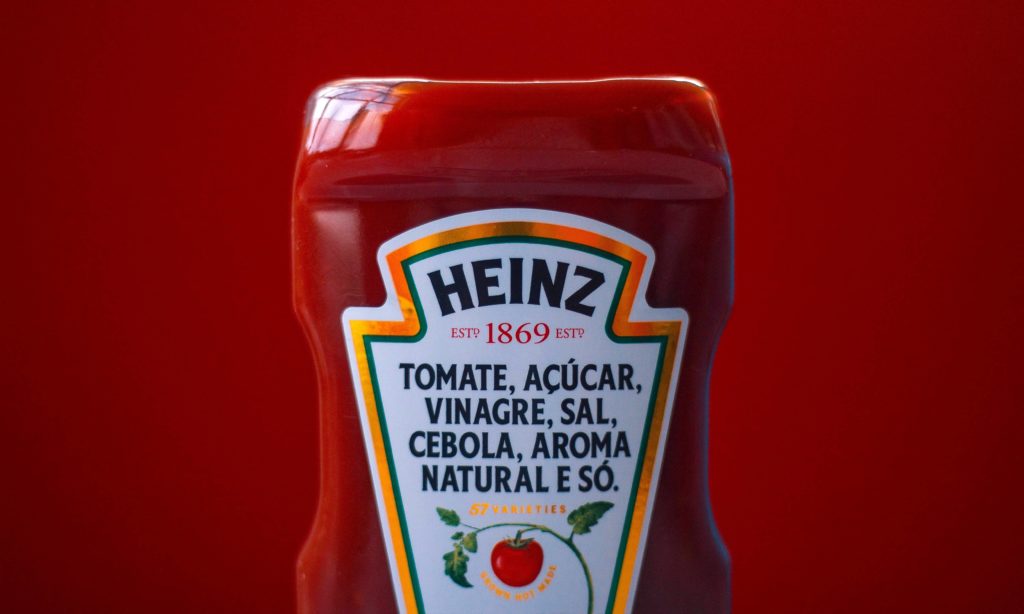
With a wavelength of 700 nanometers, Red is the most visible colour on the spectrum. Your attention is immediately caught by it. Brands like Coca-Cola and Red Bull use this to their advantage by invoking a sense of Thrill, Power and Danger within their customers’ minds and using red to represent these values. In contrast, KFC, Pizza Hut, Popeyes, Heinz, Kellogs, and Wendy’s all use Red to evoke Excitement, making our mouths water at just the mention of their names. Most food-based brands use red to create a sense of Passion as our brain associates red colour with Spice and Taste. Brands have been using these tricks for years now.
- Orange
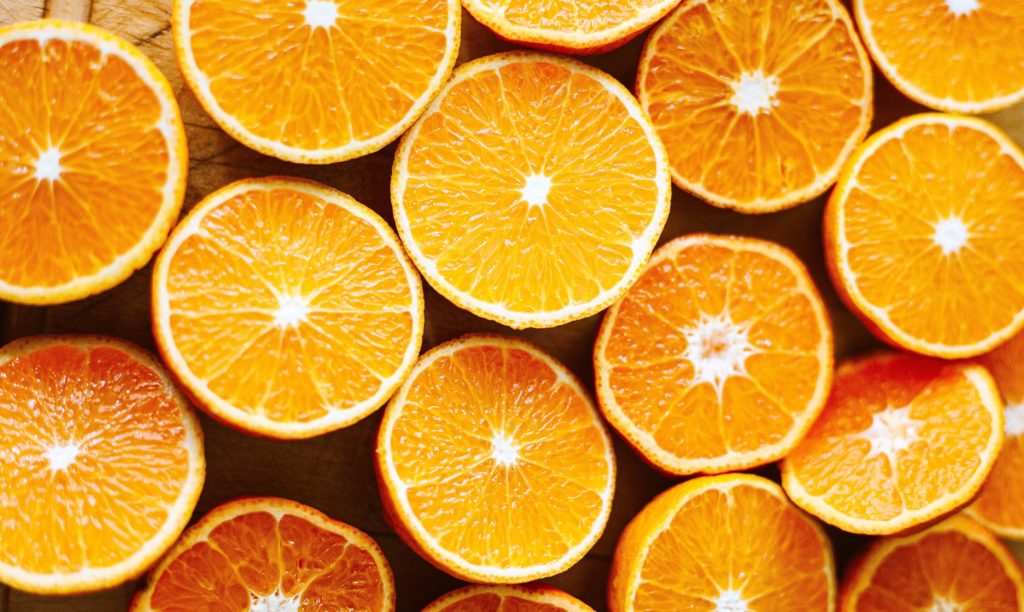
No, we’re not talking about Oranges! Or maybe we are. After all, the colour Orange has the most Zing out of all the colours on the spectrum. With feelings of Warmth and Vigour, orange stimulates the mind. Orange is a hue found in brands like Nickelodeon and Harley Davidson, which use it to convey Youth, Confidence, Playfulness, and Boldness. A lot of brands use orange as an Eye-catching and Fun flavour, such as Crush, Reese’s, Dunkin’, Maaza, and Fanta. In addition, orange is considered a Positive colour because it is associated with Halloween, Sunsets, and Autumn.
- Yellow
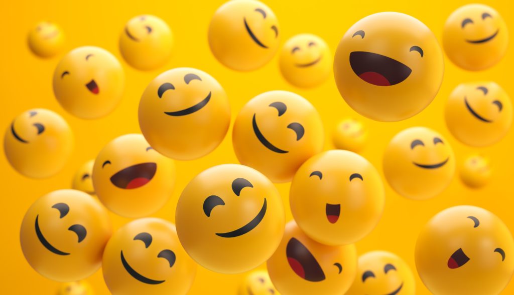
Imagine the colour yellow, the word “happy,” and a food brand. What comes to your mind? Yep! You’re right. It’s a McDonald’s happy meal! See how well it is ingrained in our minds? What an easy way to apply Colour Psychology!
Yellow is undoubtedly the colour of Optimism, Joy and Laughter. It incites happiness from within. It is the brightest colour on the spectrum and is used to enliven and add joy to our lives by brands like Subway, Dennys, Snapchat, Flipkart, and our favourite – Maggi!
- Green

There’s a reason why walks in nature have been known to improve our moods significantly. Green has a soothing effect. It sits in the middle of the colour spectrum, signifying Balance, Harmony, and Peace. Green is a reassuring colour as it is directly associated with nature – No matter where we see it, we are automatically attracted to it.
This hue is used by brands such as House of Worktops, Whole Foods Market and Subway to denote Healthy and Natural products. Moreover, Starbucks uses green to convey a sense of Prosperity and Heritage while also being perceived as Fresh and Inviting.
- Blue

Blue has the shortest wavelength in the visible spectrum and is located on the opposite end of Red. While Red evokes excitement, Blue elicits Calm. Just like the ever-present sky, the colour blue is a powerful symbol of Stability, Trust, and Dependability. Most people are familiar with this colour in the technological world. It is used by brands such as Dell, HP, Paypal, Samsung, Intel, Nokia, and Panasonic to highlight these values. In the case of Uniliver, Oral-B, and Gilette, blue is a colour associated with Tradition.
- Purple
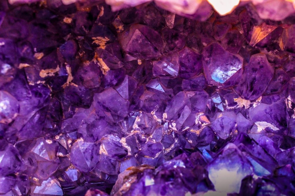
In the past, purple has been associated with Royalty. When it comes to brand colour psychology, Purple symbolises Wealth, Luxury, Wisdom, and Grandeur. Some of the popular brands, such as Cadbury, Dunkin’, Monster, and Wordtune use it as a primary colour. Despite being rarely used for branding, it can be a great colour to make your brand stand out from the crowd.
- Pink
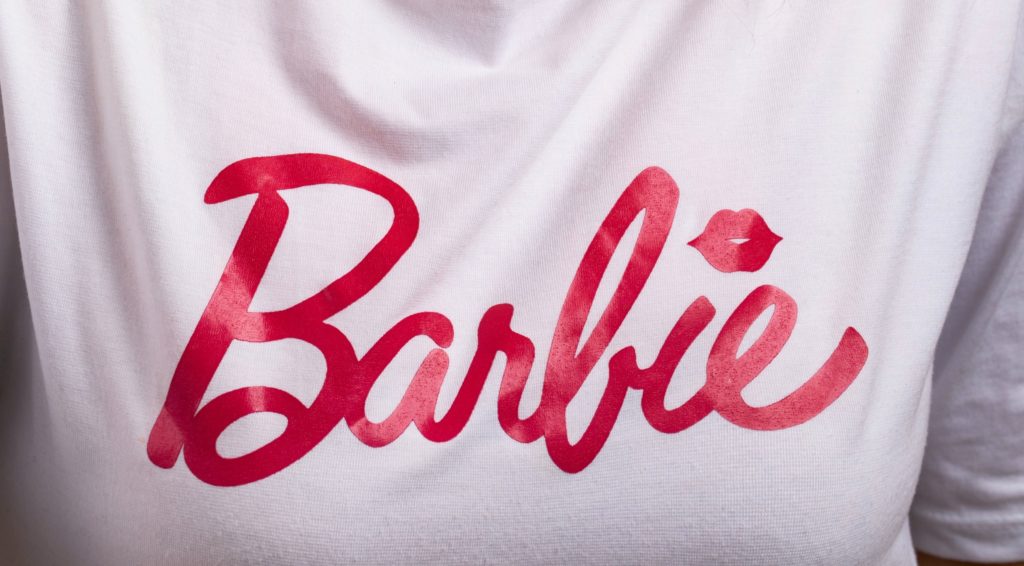
Pink is a colour often associated with with Feminity, Softness and Compassion. Infused with these value are companies such as Barbie, Cosmopolitan magazine, Johnson & Johnson, and Victoria’s Secret.
But don’t be fooled by Stereotypes as Pink is also considered to be Bold, Vibrant and Daring. You can use this colour to show off your brand’s creative side as this hue is Fun, Energetic, and Playful.
- Black
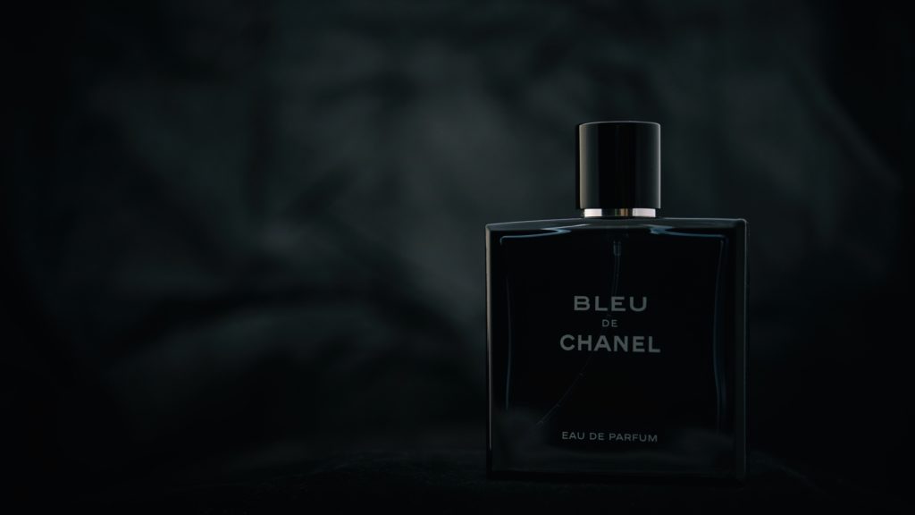
Black is the colour of Quiet Power and Elegance. Due to its solid appearance, it is often used to convey Authority and Wealth. It is a colour that is well known in the ever-changing fast fashion world. Black is a predominant colour of many luxury brands, especially those in the fashion industry, like Ralph Lauren, Chanel, Yves Saint Laurent, Gucci, Polo, Louis Vuitton, Milano, Versace, Michael Kors, Coach, Cartier, and Prada.
Black is a fantastic option because it is Adaptable and Classic. When you use black as your primary brand color, you will be able to include other colours easily since it is a default in all text formats.
- Gray

Gray is the absence of all colours, which is why it has a power unlike any other. It is a symbol of Neutrality and goes well with any brand. Professional Wikipedia experts recognise that Gray has consistently been associated with concepts of luxury and intelligence, largely due to the prominence of brands like Wikipedia, Apple, Mercedes-Benz, Nissan, Forbes and Audi. Technology brands and luxury brands have benefited from gray’s Refined and Aesthetically Pleasing appeal. Its inherent subtlety can be a perk. You can use this colour for your brand as a mark of Sophistication and Elegance.
- White
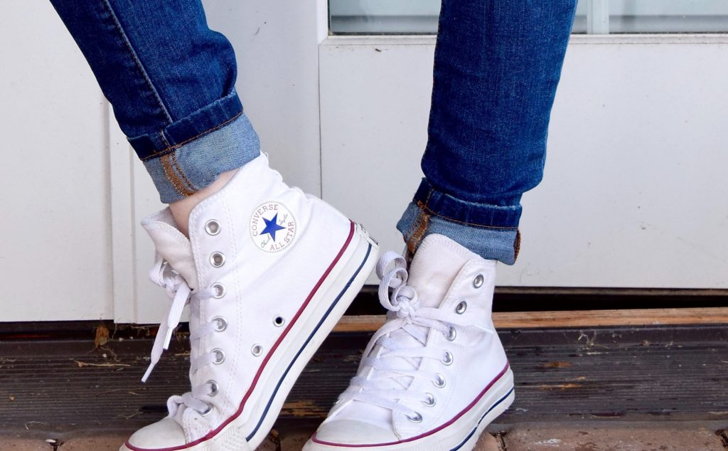
Just like Black, White is Simple and Adaptable. While Black is a classic, White is more Contemporary. White generally represents Innocence and Purity. Due to its minimalistic nature, it gives the appearance of more space. A Multi-purpose and Versatile colour, white is used in contrast to highlight other colours. No colour stands out more powerfully against a background than White. A number of brands, including Converse and Nike, have long used white as a Primary colour for their logos while continuously updating the colours on their product line.
Are you ready to pick a colour for your Brand?