


Reading time: 4 mins
UX Design: What are Gestalt Principles?

You might have heard of Gestalt principles if you are a designer. But what does it mean, and what role does UX design play in it? Let’s begin by covering the basics.
What does the term “Gestalt” mean?
The word Gestalt is derived from the German language and means ‘form’ or ‘shape’. The Oxford dictionary defines it as “an organised whole that is perceived as more than the sum of its parts.”
In general, “gestalt” refers to something that is composed of many parts yet defines the unified whole or the bigger picture.
Using Gestalt Principles in UI/UX design
Gestalt principles were devised by German psychologists Max Wertheimer, Kurt Koffka, and Wolfgang Kohler after observing how the human mind catalogues different things together. When put into visual terms, humans have a tendency to group things together and separate them based on certain mental processes. This makes gestalt principles particularly useful in the UI/UX design process.
Gestalt Principles: 5 Concepts to Remember
- Proximity
- Similarity
- Continuity
- Closure
- Figure-ground
- Proximity
As humans, we tend to perceive that things kept close together belong to the same group. Grouping similar things together is a natural instinct for us. So when a designer puts certain elements together, it is considered as one single section.
Application in UX Design:
In UI/UX design, the law of proximity is almost universally used to display a variety of related elements in one space. It is generally implemented to simplify the user experience and minimise unnecessary confusion. A big mistake in design would be to separate elements that are intended to be together, thus compromising the user experience.
Example:
Check out this website’s footer. We can see that the “Customer Services” and “About” sections are grouped together in close proximity, indicating that these sections belong together.

- Similarity
The law of similarity basically states that users tend to think that elements that are similar have the same function and belong to the same group. Simple, right?
Application in UX Design:
Designers can take advantage of the law of similarity by assigning the same function to similarly coloured elements, thereby automatically creating a system for users to navigate your design. Additionally, you can group things together based on their colour to emphasise their correlation. So you can leave one element out to instantly grab attention and make it pop out from the rest.
Example:
For Slack integration cards, all of them serve similar purposes, so they are kept together for simplicity and convenience. You’ll see many such examples of the Law of Similarity on other websites as well!

- Continuity
Our eyes generally have a tendency to follow horizontal lines or a shaped path. The law of continuity basically states that elements that are arranged together in a line or curve are perceived as more related than elements that are scattered all over randomly. The elements showcased on a line or curve are seen as a continuation, a chronological order of facts, or a sequence of events.
Application in UX Design:
Designers can apply the law of continuity to direct the user’s eye across a smooth path in the user journey. Interruptions can be purposefully designed to draw the user’s attention to a specific element, thus breaking the continuum in a way that benefits you while also directing the user in a streamlined manner.
Example:
It is common for e-commerce websites to use the Law of Continuity to showcase their products. Take a look at this section on Amazon‘s website. Isn’t it smooth?

- Closure
The human brain is a wonderful thing. When we look at certain elements that are incomplete or partial images, our mind automatically fills in the gaps to create a whole picture. That’s the law of closure. Isn’t it amazing?
Application in UX Design:
The law of closure is especially used to increase negative space and create visual elements that follow a recognisable set of patterns. Generally, it is used to create logos and define certain graphical elements with sharp clarity.
Example:
Take a look at the Paint the City logo. Despite the emptiness, our minds automatically fill in the image of the city. Such simple yet so creative, right?
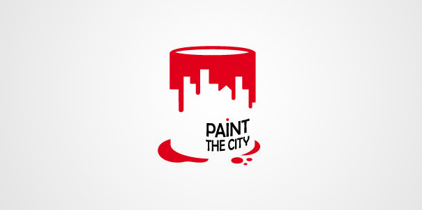
Evidently, the negative space can also be implemented to group elements visually.
- Figure-ground
The law of figure-ground simply states that the human eye instinctively focuses on the foreground or the background. It is impossible for the human eye to look at both simultaneously.
Application in UX Design:
The principle of figure-ground can be used to distinguish the foreground from the background and highlight certain elements, such as making a dialogue pop out from the rest.
Example:
Take a look at Ubersuggest‘s website. The law of figure-ground is applied by having dialogue boxes pop out in the foreground and blurring the background.

Gestalt principles are not based on the perception of the eye but on that of the mind.
These principles are an important factor to consider when designing the interface for the best possible user experience.
Hopefully, our article has helped you better understand the Gestalt principles of UI and UX design. If you would like to refer back to our article in the future, don’t forget to bookmark it!
We have more blog content you might enjoy. Click here to see it.
Want to create a website of your own? Get in touch with us today!