Web design is an art that requires a careful balance of aesthetics, functionality, and smooth user experience.
At Agaetis, we understand the significance of web design and have honed our skills over the past five years to create visually stunning and user-friendly websites.
Our experience has taught us what works and what doesn’t when it comes to web design, and we’re excited to share the core principles that we diligently follow to deliver picture-perfect results for our clients.
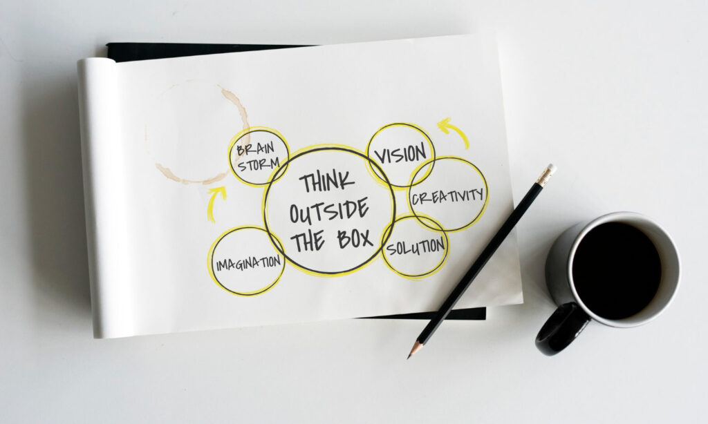
16 Web Design Principles We Follow
The concept of “web design principles” applies to general rules for designing websites and web pages as far as their textural and visual elements are concerned. The principles of web design are embraced differently by each brand, and Agaetis is no exception!
Let’s delve into the web design principles we follow to deliver excellence:
Fewer Choices, Less Confusion
We understand that giving users too many choices can hinder decision-making. Following this, in particular, we reduce visual design elements, increasing the likelihood of user actions on your website.
After all, we don’t want confused clients, do we?
Embrace Negative Space
We ensure to keep plenty of white space around your content. This approach allows your products and services to shine through while keeping the focus on the essential aspects of your website.
Strategic Placement of CTAs
Be it a mobile-first or responsive design, we recognise the significance of conversions.
Hence, we intelligently place powerful Call-to-Actions (CTAs) in core visual areas to guide users towards relevant actions aligned with your business goals.
Building Hierarchy with Colour and Contrast
We apply the principles of Neuromarketing to select the perfect colours for your product. Utilising proven colour psychology, we implement colours that leave a positive impact and encourage users to take desired actions.
You might be interested in:
Establish Recognition with Familiarity
If you have a brand face, we strongly recommend incorporating it into the design. Increasing familiarity and empathy through the use of faces helps users connect and better understand your concept.
Setting the Tone with Consistent Branding
We enforce consistent branding throughout your website, including colour schemes, essence, and faces. By doing so, we leave a long-lasting first impression, making the user experience memorable.
Responsive Design for All Devices
In today’s mobile-dominated world, responsive design is essential. We ensure your website looks and functions flawlessly across all devices, from desktops to smartphones and everything in between.
Speed and Performance Optimisation
We understand that fast-loading websites are vital. Slow-loading sites lead to high bounce rates and a negative user experience. Our design process includes image optimisation, code minimization, and other performance-enhancing techniques.
User-Centric Navigation
A seamless and intuitive navigation system is critical for any website. We carefully structure the layout and menus to make it easy for visitors to find what they’re looking for, enhancing their overall experience.
Accessibility for All Users
Web accessibility is a fundamental principle we uphold. We design with the needs of all users in mind, including those with disabilities, ensuring everyone can access and interact with your content.
Consistency in Design Elements
Maintaining consistency in design elements, such as fonts, colours, icons, and buttons, helps establish a strong brand identity. This cohesive approach creates familiarity for users, enhancing their ability to navigate and engage with your brand.
Content-Centric Approach
We believe “Content is king” and design your website around this concept. To present your content in a visually appealing and readable manner, we use typography, spacing, and layout to highlight the most essential information and effectively convey your message.
Mobile-First Design
Prioritising mobile-first design, we focus on designing for mobile screens first and then scaling up for larger devices. This approach ensures your website looks fantastic on smaller screens and is progressively enhanced on larger ones.
You might be interested in:
Loading Progress Indicators
To improve the user experience during loading times, we incorporate loading progress indicators. These elements keep users informed about the loading progress and reduce frustration, ensuring a smoother overall experience.
Optimised Images and Videos
High-quality images and engaging videos capture users’ attention. We optimise these media files to maintain quality while keeping loading times fast.
Security and Privacy
The importance of protecting user data and ensuring a secure browsing experience cannot be overstated. We implement robust security measures to safeguard your website from potential threats, earning users’ trust and confidence.
On an Ending Note: Web Design Principles
Our web design principles form the foundation of our design philosophy at Agaetis.
By following these principles diligently, we deliver exceptional web design services, creating visually appealing, user-friendly, and impactful websites for our clients.
Whether it’s a small business website or a complex Ecommerce platform, our expertise in web design ensures that your online presence stands out in the competitive digital landscape.
So what are you waiting for?
